Color Psychology: Commercial Paint Colors Best Suited For Your Office - XYZ Construction & Renovation group
Fri, Oct 15, 2021
Read in 5 minutes

Not only does color psychology affect how peaceful you feel in your bedroom or the kind of vibes your hallway radiates, but it can also impact your employees’ productivity at work. Most businesses pick their brand colors and then forget about them. Although they may use these colors on their company’s business cards, this doesn’t necessarily work when choosing a color scheme for the office building. Here are some of the most popular commercial paint colors and their psychological effects. Also, learn how you can use these commercial paint colors to bring life into your office space.
Blue
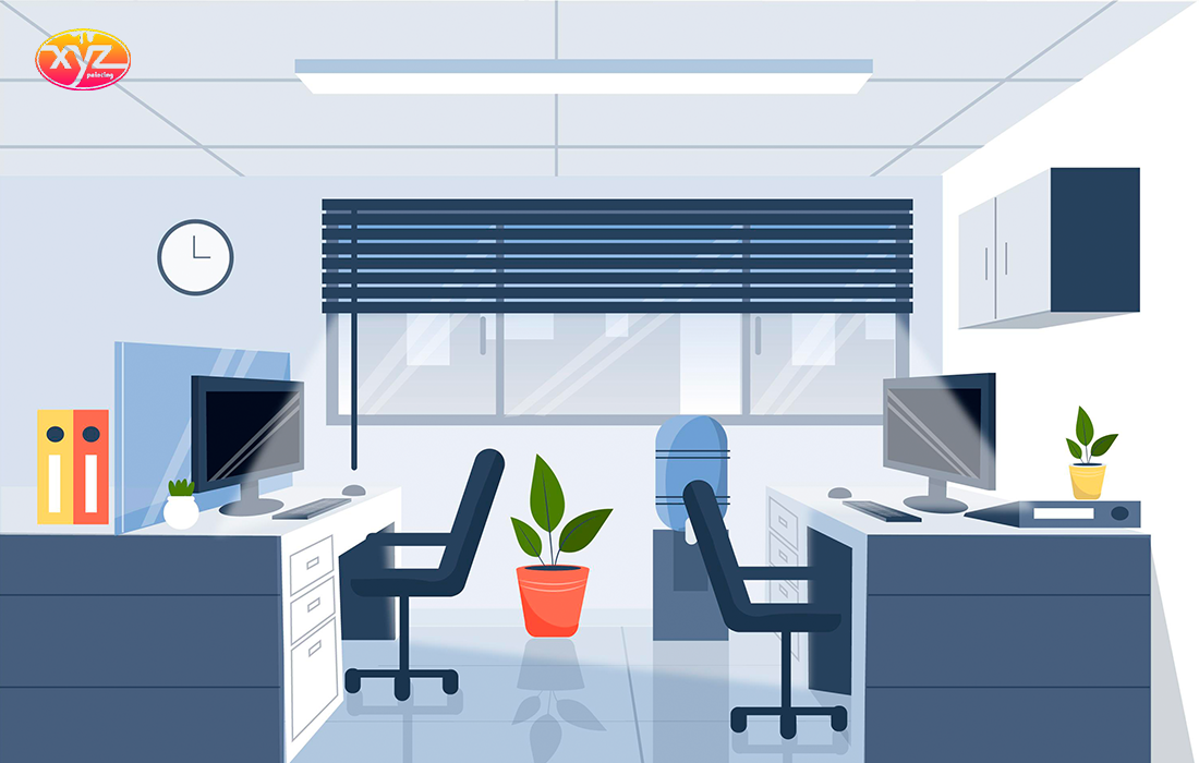
Despite the fact that blue was traditionally considered a color only for men, it is now one of the most appealing colors for everyone. Blue has many benefits. It promotes calmness and is soothing. It also encourages communication and efficiency. Blue is the most widely used color in large businesses and corporations. Blue is also a popular color for branding. Consider using it in your office as the main color. This will set the tone of how you want your office space to function.
Red
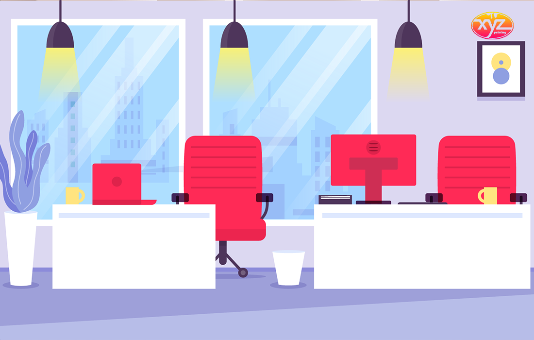
Red is the second most commonly used color in branding. It evokes intense emotions, such as urgency and attention. It is commonly used to promote urgency in sales and restaurants, as well as in medical facilities. The type of business you run will dictate how much of this color you use in your office. The amount of red in your logo will also play a huge role in how much red should be used for your office building. A logo with only a tiny amount of red means it’s not a good choice as a base color for your office. You might use it in meeting rooms and interview spaces where intensity, attention, and focus are important.
Grey
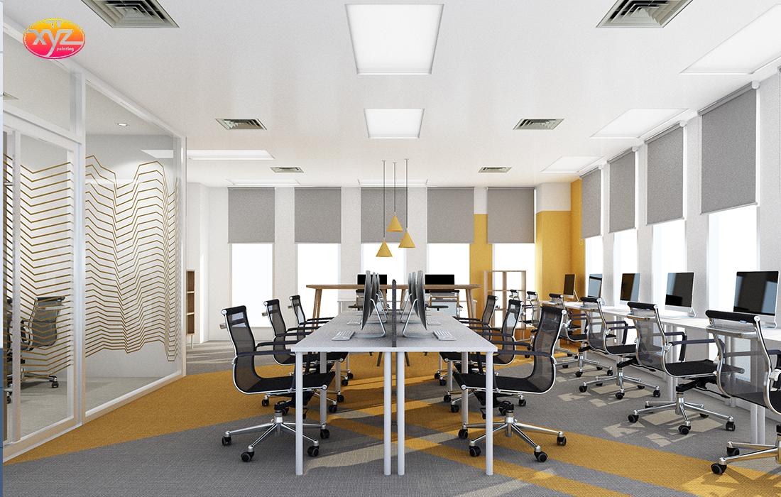
Grey is a neutral color and is great for any occasion. Most brands have a variety of colors, but they almost always use a grey shade. Grey is calming and brings clarity into an area. It gives your office a professional and elegant look, which is great for clients who visit. Because grey is a neutral color, it can be used as the base. You can then add accents of other brand colors onto it. This will make your office space look professional and creative. Grey falls somewhere between white and black and is the perfect color for those who love black and want its substitute for the same intensity. There are many shades and hues available in grey that can be used to evoke different feelings.
Green
For logos and brands, green is becoming more popular. The color once associated with money and vegetables is becoming a symbol of sustainability. McDonalds and other large corporations have switched to an earth-green base color for their restaurants around the world. Green has a harmonizing and balancing effect. It inspires feelings of prosperity, stability, nature, and renewal. You might consider adding green to your brand’s office space. This will give employees and clients a sense of wealth, stability, renewal, and security every time they step into your office. These feelings are crucial for a business as they indicate that it will continue to be successful.
White
Although too basic, white is still a popular choice for office spaces. In case you feel white will make your interior space look insipid, you can inject some color into the scheme by using furniture and decor items in other colors. If you have a small space to work in, white is a great option. It is reflective and can make the office seem larger.
As far as interior paint for office spaces is concerned, white is always safe. This is good if you don’t want to be too bold and just need to refresh the space.
Teal
Because teal is a blend of blues and greens, it can transform any workspace into an efficient productivity machine. It is important not to have too many colors when your main color is teal. You must also consider the intensity and brightness of your desired effect.
Light Blue
A toned-down, soft, light blue can help to calm the environment and emit a tranquil vibe. This is a good choice if you are a private doctor, particularly a specialist who deals with nervous patients on a day-to-day basis.
Blue-Gray
Blue-grays in the corporate world can look clean and add a lift to a backdrop. Blue-grays exude professionalism while also not being too moody.
Brown
Brown looks great in spaces that are strong and powerful. A combination of brown and rich wood office furniture can give off a truly warm feeling. Brown is also masculine and versatile.
Purple
Although purple comes in many shades, a subtle purple can be used to complement a feminine space such as a salon. Purple is an elegant color associated with fantasy and opulence. It’s a wonderful choice for bars and nightclubs. For hotels, restaurants, or other hospitality venues, accent walls in purple can be incorporated to add dimension and interest with glossy or matte finishes.
While these colors might seem simple, they can have a powerful psychological impact on people. Adding these colors will not only improve creativity and productivity but also strengthen your brand image for your employees and everyone who visits your office. For a quality paint job, hire any of the best commercial painting services in your area.
Although many people think about cost-effectiveness, that shouldn’t be the sole criterion while hiring a commercial painting company. Their skills and painting know-how is extremely important.
Get A Free Estimate!
Recent Posts
Drywall Contractors Vancouver
Drywall Service in Richmond
Drywall Contractors Surrey
Why Build Your Home Partition with Drywall?
Make Your Home Walls Beautiful and Safe with Drywalls